We are getting so close to moving (this weekend)! I’m so sad to leave our friends where we are, but looking forward to settling in and starting a new chapter. We are only moving about 25 minutes from where we live now, but I’m lucky to have some of my closest friends walking distance from our current house. When I share my home on Instagram and Facebook one of the most frequent questions is about the paint colors I selected.
A word of caution – buy paint samples! Choosing paint colors off the internet often doesn’t end well. I selected Benjamin Moore “tranquility” for my bedroom based on a photo on Pinterest. It looked like a light gray. In person it’s much too dark for my tastes and VERY GREEN to my eyes. Two cans of paint later I saw it on my bedroom walls and knew it wasn’t for me so we used the color in Cam’s room so it wouldn’t go to waste. It’s a nice color – but I wasn’t going for green.
My Top 3 Light Neutral Paint Colors
Today I’m sharing the top 3 colors I used in our current home. I’ll be using all 3 again when we move!
1. Benjamin Moore “Calm”
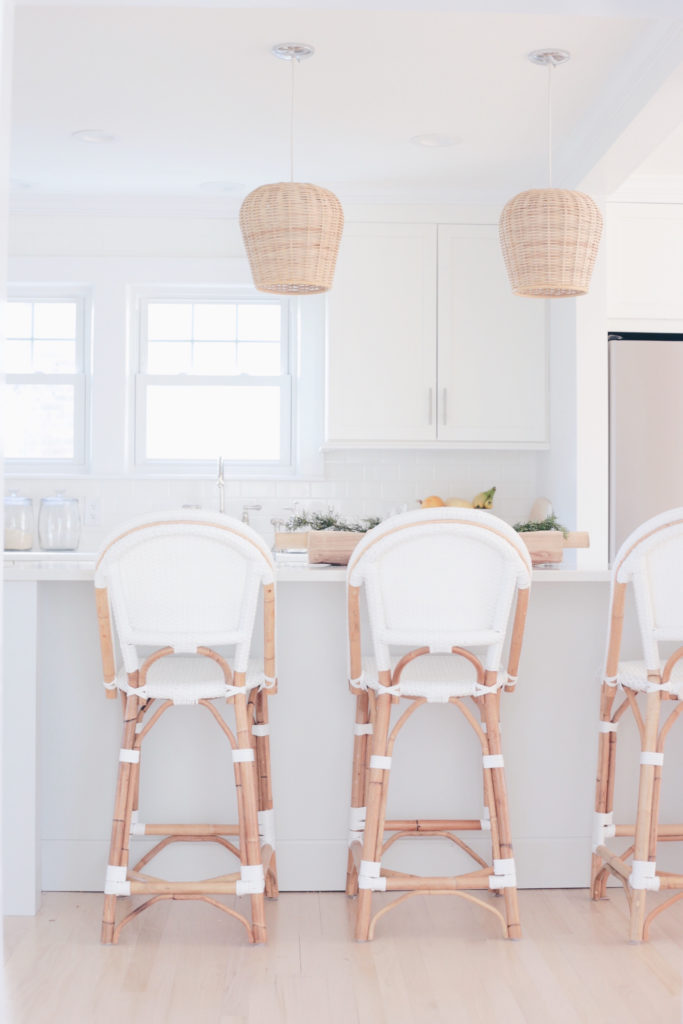
This color is a super light gray to where it almost looks white in the sunlight. I love the subtle contrast it gives against the white trim. This color looks darker to me online than it does in my home. I used “calm” in my master bedroom and kitchen.
2. Benjamin Moore “Classic Gray”
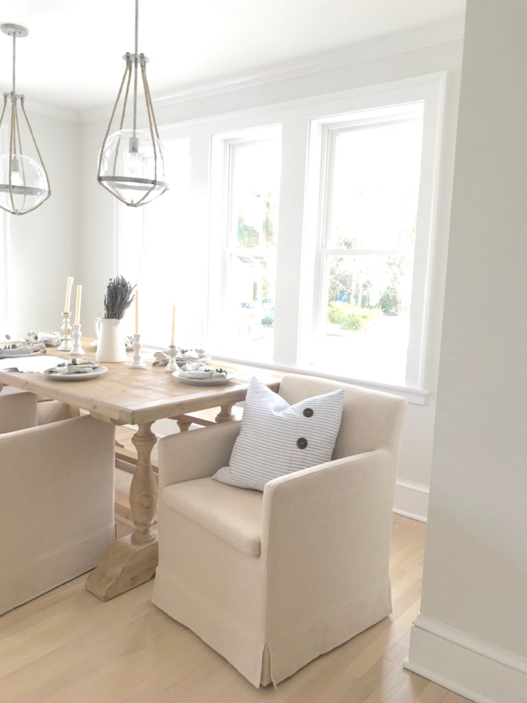
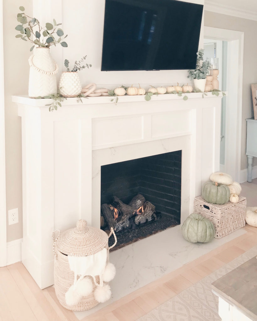
In the lighting of my home “classic gray” appears just a bit more beige and a tad darker than the “calm”. I have this color in my downstairs powder room and the hallway between my kitchen and living room. To me it looks like a lighter version of “Revere Pewter” which I have in my living room and all the other hallways in our home. While I like the “Revere Pewter” it appears dark for my tastes on cloudy days.
3. Benjamin Moore “Decorator’s White”

Sometimes simple is best! Some followers were surprised I chose white, which surprised me since so much of my home and wardrobe is shades of white. Until you shop white paints you don’t realize how many variations there are. Some evoke creamy/yellow white and some have blue undertones. The “Decorator’s White” is simply white to me. Oddly enough “Simply White” is the name of a paint color and decorator’s white looks GRAY on Benjamin Moore’s site. I can assure you, however, we painted the floors and walls at our beach cottage in “Decorator’s White” as well and it is WHITE ?.
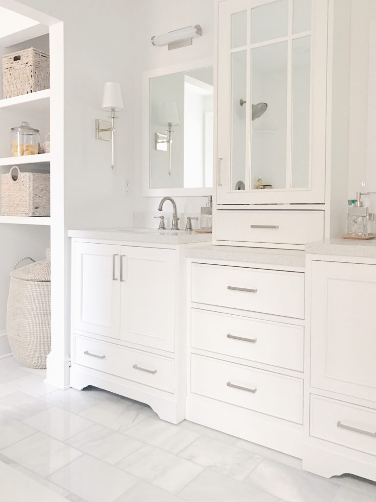
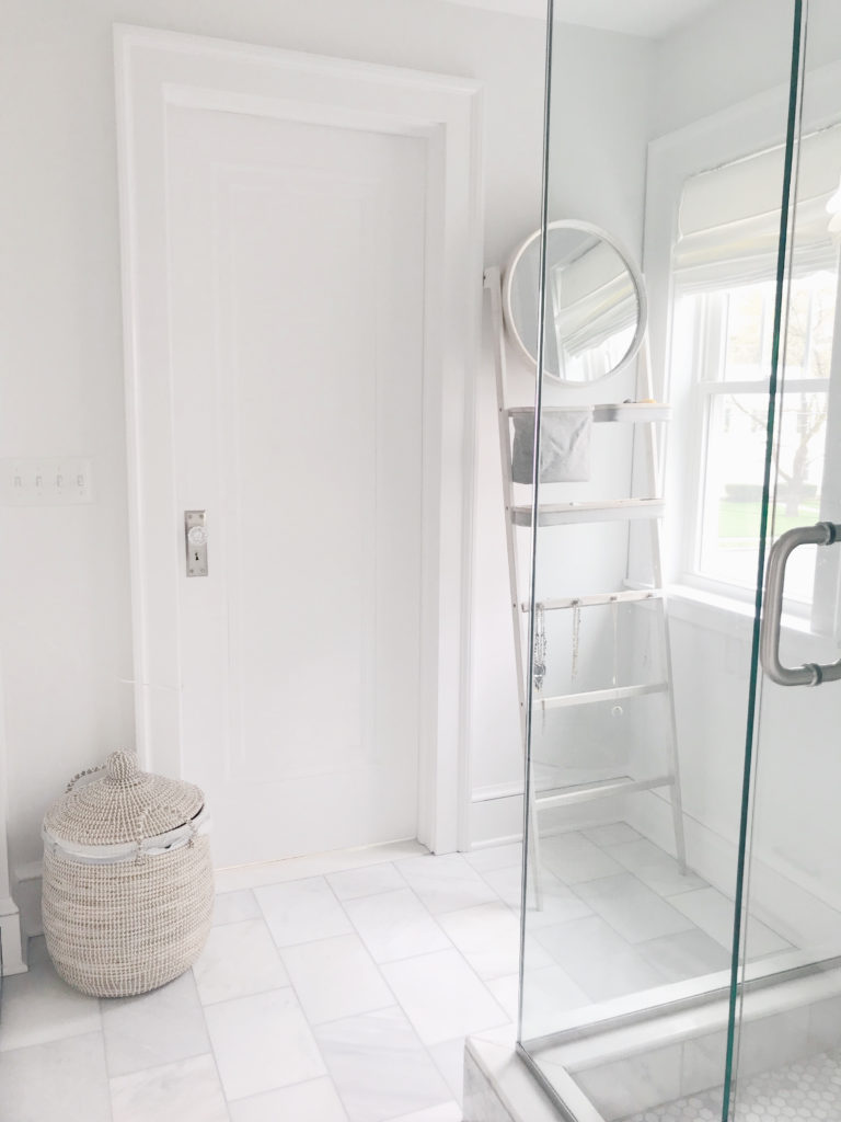
I used “Decorator’s White” in my master bathroom (see more renovation pics here) and in my “office”.
Years ago when we first did a DIY kitchen renovation we used “White Dove” on our cabinets because I’d seen it suggested online. That is a much creamier white and I only notice because of the contrast between our trim color which is on the moldings above the “White Dove” cabinets. Our trim color was a custom mix so unfortunately I don’t have a name to pass on.
As I mentioned, I love these light neutral paint colors so much I will be using “Calm”, “Classic Gray”, and “Decorator’s White” again in our new home. If you’re considering any of these – again – put a sample on your wall first! The amount of windows, color of the flooring, so many things factor into how colors look in your home.
If you have any paint colors you love – please drop them in the comments below so other readers (and I) can check them out!! Thanks for stopping by.

Danielle Sherman
October 10, 2019 at 2:30 pmI love all of these paint colors! Thanks for the info 🙂
Rachel
October 21, 2019 at 3:27 amthank you Danielle! so glad you found this post helpful.
xoxo
Rach